

Returns are costly for e-commerce owners. From warehouse management to pre-paid shipping, excessive returns can make a huge dent in your profit.
And that’s not the only issue.
Frustrated shoppers who struggle to find the right item for their needs will likely leave your store and move on to a competitor.
That’s where e-commerce size guides come into play.
With well-thought-out size guides, you can improve the online shopping experience in your store and eliminate a huge potential barrier to buying.
While there is no one-size-fits-all formula for effective size guides (pun intended), here are seven of the best e-commerce size guide examples I’ve recently seen, and why they work well.
I’ll start with the bad news first: most size guides I’ve seen while researching for this post were an absolute mess.
Most e-commerce sites had either (1) an oversimplified size chart that doesn’t explain anything or (2) a lengthy screenshot with measurements for all the product categories you can imagine.
The good news is, there’s a better way to have simple yet helpful size guides in your store, and Monki masters this art.
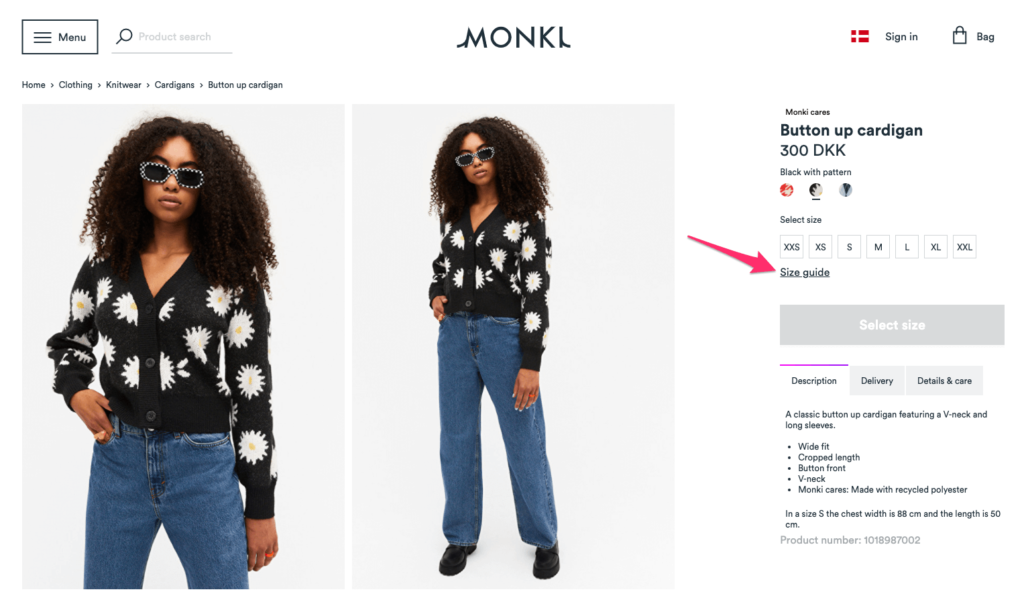
Following best practices, Monki places a link to its size guide on product pages, under the size selector:
When clicked, a modal pops up, with multiple subcategories you can click to expand:
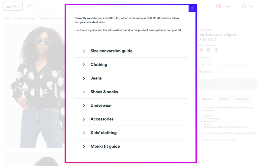
Rather than have one long list of measurements for different product categories, such as shoes, underwear, or accessories, Monki uses sub-headings, so you can click the category you’re shopping for and get the information you need.
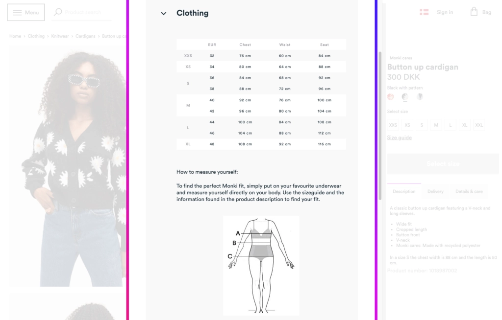
When you click one of the categories, you find all you need to know in one place, including a guide on how to measure yourself correctly:
Last but not least, Monki includes a section called “Monki fit guide” in its sizing modal, where you can learn what different terms, such as “oversized” or “tight fit” mean on the Monki website.
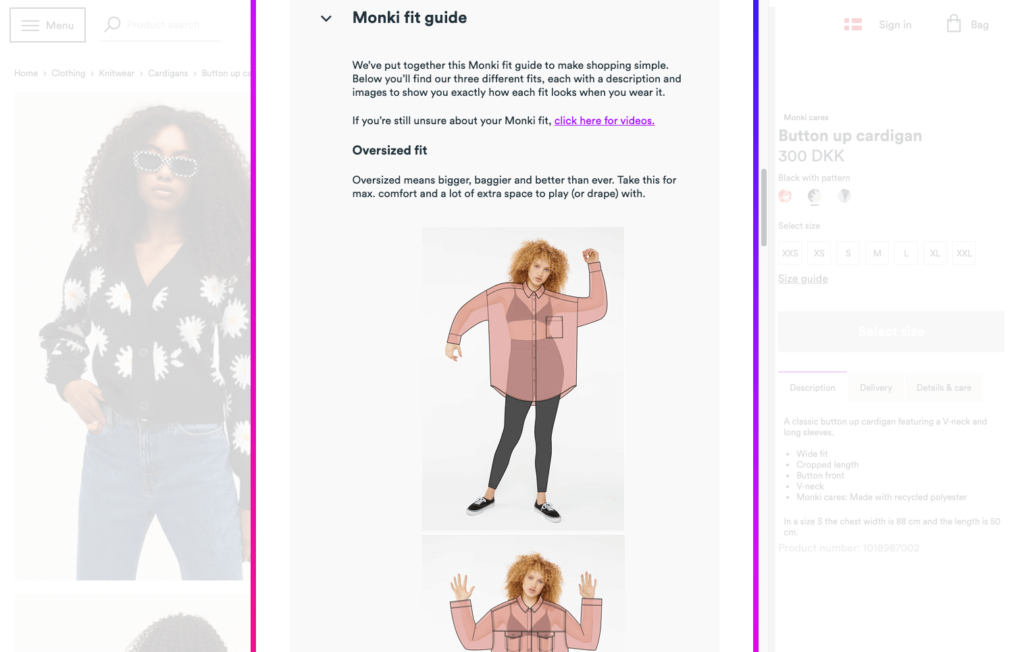
This little addition makes shopping much easier for Monki’s visitors since different apparel brands may have different understandings of what an oversize fit looks like.
To help minimize returns, Monki also creates a dedicated landing page for its fit guide and explains in detail what you can expect from its products with videos.
You don’t need to go this far in your size guides but Monki’s popup is a great all-in-one solution you can model from especially if you’re selling products from multiple categories.
While Monki keeps its size guide simple and compact, Abercrombie & Fitch offers one of the most detailed size guides I’ve seen. More fascinatingly, the company does it in a way that doesn’t confuse or overwhelm visitors.
Let’s take a look at it, step by step.
When you land on one of Abercrombie & Fitch’s product pages, you see a link that reads “Size and Fit Guide” under the color and size selection:
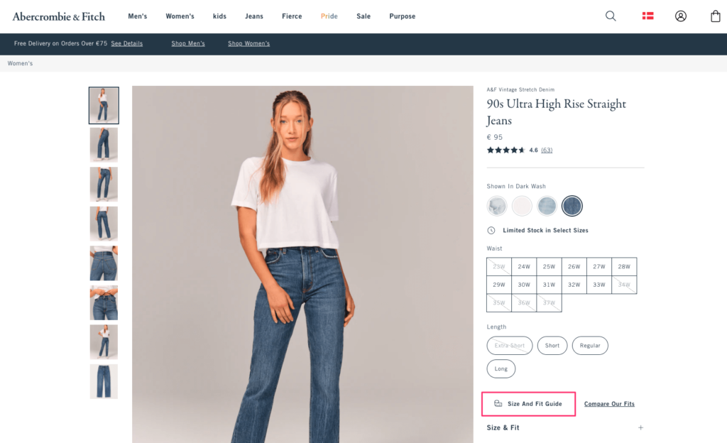
Similar to the previous example, clicking this link opens a modal on the same page, so you can get size information without abandoning the product you’re viewing:
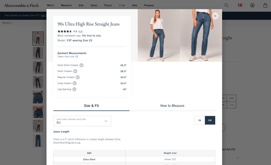
In this guide, Abercrombie & Fitch provides you with everything you need to make an informed buying decision. Its size guide includes:
There’s a lot going on here, so let’s break it down into smaller pieces.
First, notice the “Size Chart Region Selector” under the “Size & Fit” menu that allows visitors to switch between multiple regions and measurements.
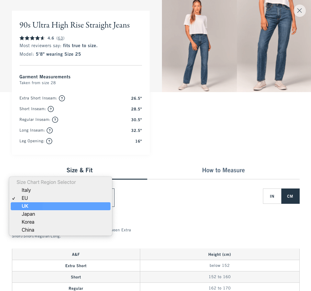
The company also lets you change between inches and centimeters if your country isn’t listed here. This is essential since Abercrombie & Fitch is a global brand, operating in over 16 markets.
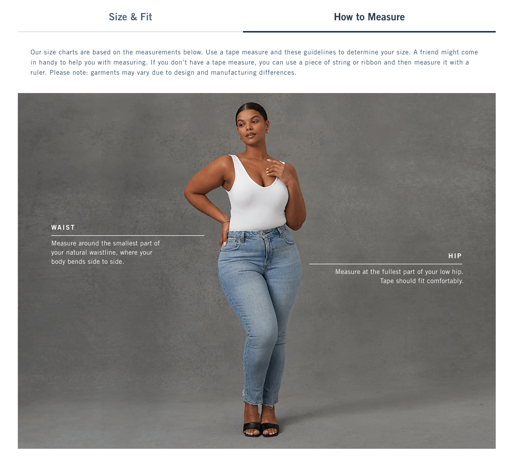
When you move to the second tab, “How to Measure,” you read basic tips for measuring your waist and hip, so you can find the perfect pair of jeans.
What I like the most about this size guide is its level of detail. Abercrombie & Fitch goes the extra mile by giving you exact measurements of its jeans’ inseam length, leg opening, and more. What’s better, by using tooltips, they explain what these measurements mean.
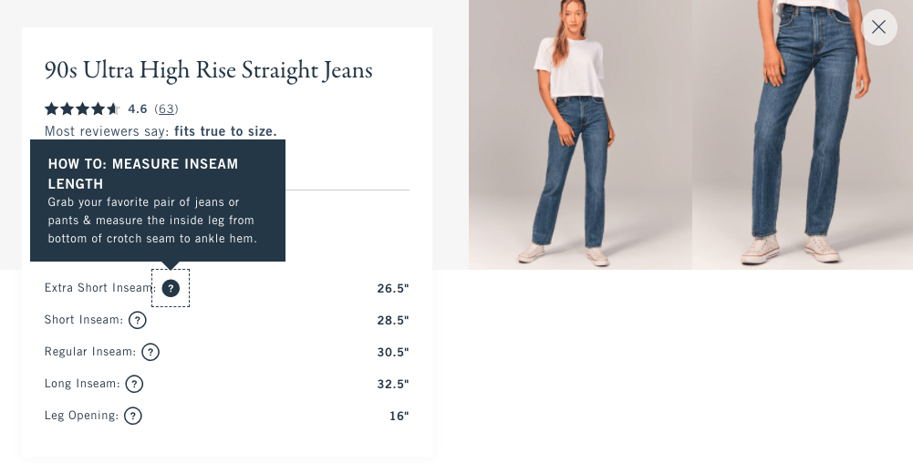
Finally, Abercrombie & Fitch features what customers who bought this item think of its fit. When you click the product’s rating, you can read all the testimonials it received:
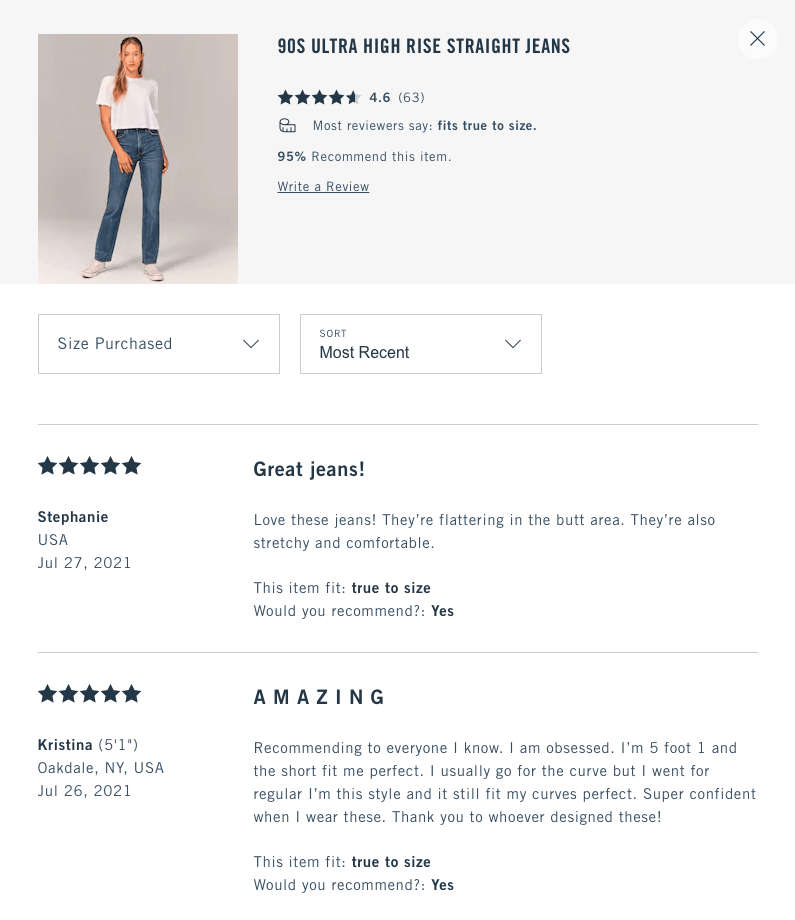
All in all, Abercrombie & Fitch offers its potential customers a smooth shopping experience and helps them find the right item without jumping to a landing page.
Size guides like the above are common in fashion. They typically include breast, waist, hip measurements, and you—more or less—know what to measure.
But if you’re selling items other than clothes, things can easily get complicated. That’s a challenge for retailers of accessories, but brands like Daniel Wellington know how to overcome this well.
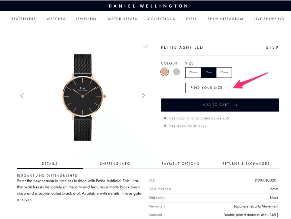
When you visit one of the company’s products, you see a noticeable “Find Your Size” button before the call to action (CTA) “Add to Cart”:
A popup opens on click, including a simple comparison chart between four sizes. But after that, Daniel Wellington does something brilliant: they show the product in different sizes, in a context.
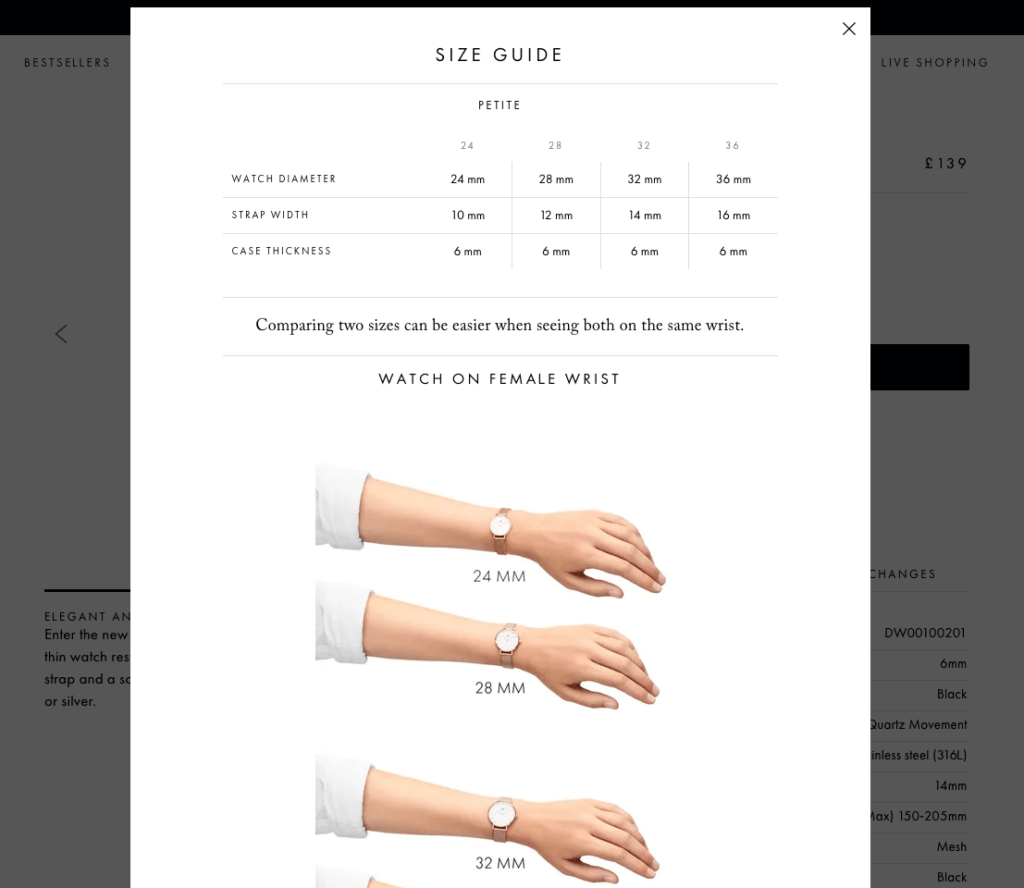
Granted, we don’t all have the same wrist size, but this comparison still helps shoppers understand what a Size 24 looks like, compared to a Size 36.
For its unisex products, the brand lets you see the watch on a female and a male wrist:
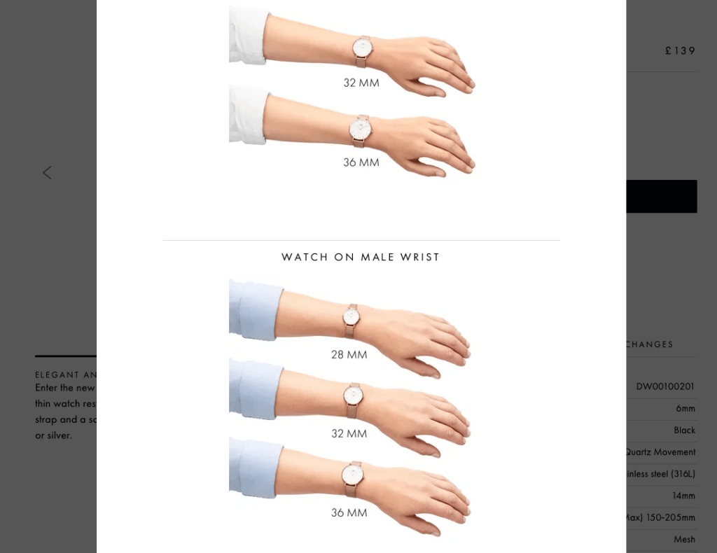
It’s just an estimate but showing your products in action is always a good idea—not only in size guides but also in your product photography.
If you want to replicate Daniel Wellington’s size guide, design a simple popup and set it to appear when visitors click a specific button on your product pages:
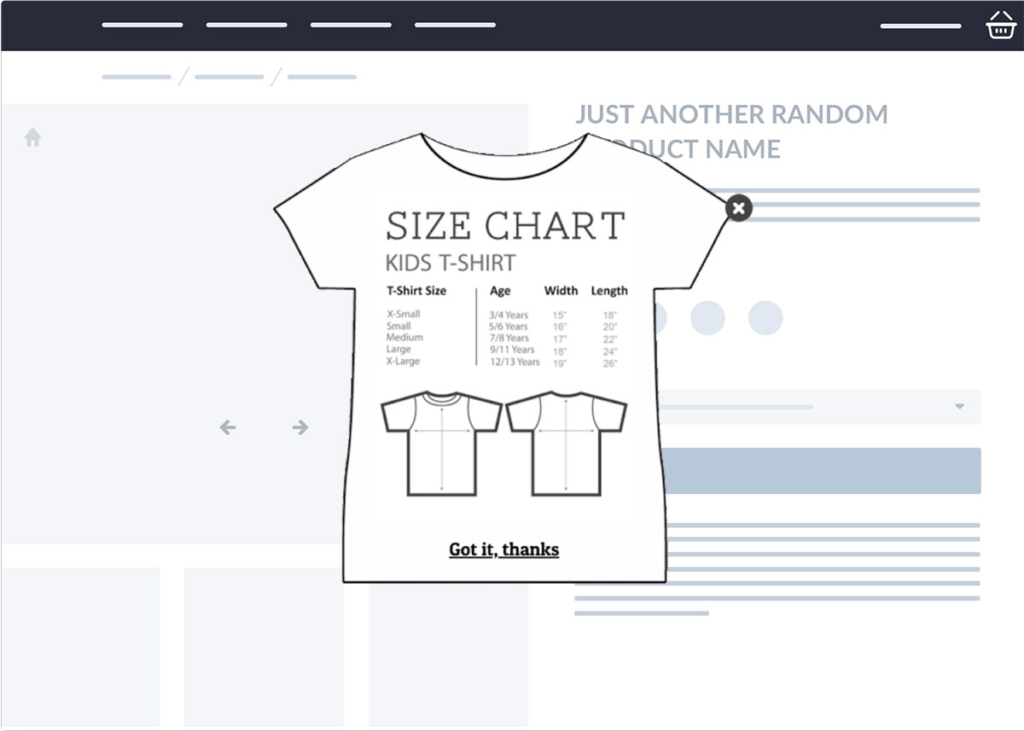
For more complex products, you can embed a video in your popup and help visitors easily understand how to find the right measurement:
If you ever shopped for glasses online, you know the struggle. You’re about to commit to wearing something on your face every single day, yet you have no idea how it will look on you.
And if you never owned a pair of glasses before, finding the right size is an even bigger challenge.
Luckily, today’s inventive eyewear e-tailers, like EyeBuyDirect, got you covered.
When you check out a pair of EyeBuyDirect glasses, you notice a link that reads “Find your size”:
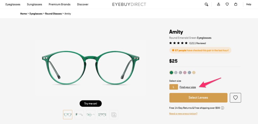
Unlike most others in this post, EyeBuyDirect’s size guide opens on the right sidebar, instead of the center position:
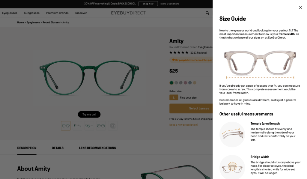
This works well for EyeBuyDirect since this action doesn’t take you to a new page either. In this sidebar popup, you can read about the important measurements when buying glasses, such as temple length and bridge width.
If you need more information, EyeBuyDirect also offers a landing page with a detailed size guide and links to the page from the sidebar modal, too.
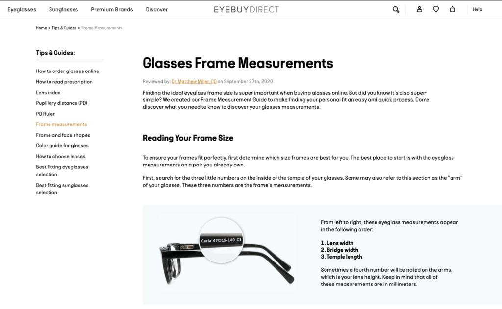
If you are still unsure about how to find the perfect pair of glasses, EyeBuyDirect offers you a virtual try-on feature on its product pages:
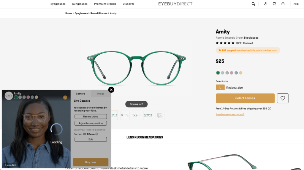
You don’t necessarily need augmented reality if you’re selling pants or shoes, but it may be an option to consider if you’re an eyewear or beauty brand.
So far I’ve talked about the popular formats and key features of the best e-commerce size guides.
This example from Mugsy has a completely unique approach to its size guides. And it’s not so much about the technology or design it uses, but about copywriting.
When you visit one of Mugsy’s product pages, you see a section called “Fit Guide” below a lighthearted product description:
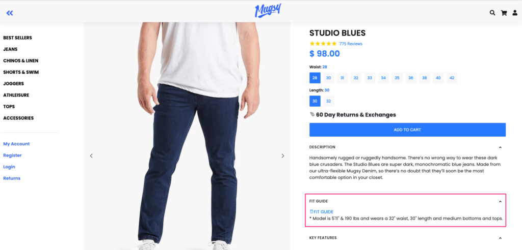
If you’re familiar with Mugsy’s products (or if you’re not a picky shopper,) this sentence informing you about the model’s size and measurements can be enough to find your size.
But if you need more information, you can click the headline and open this popup:
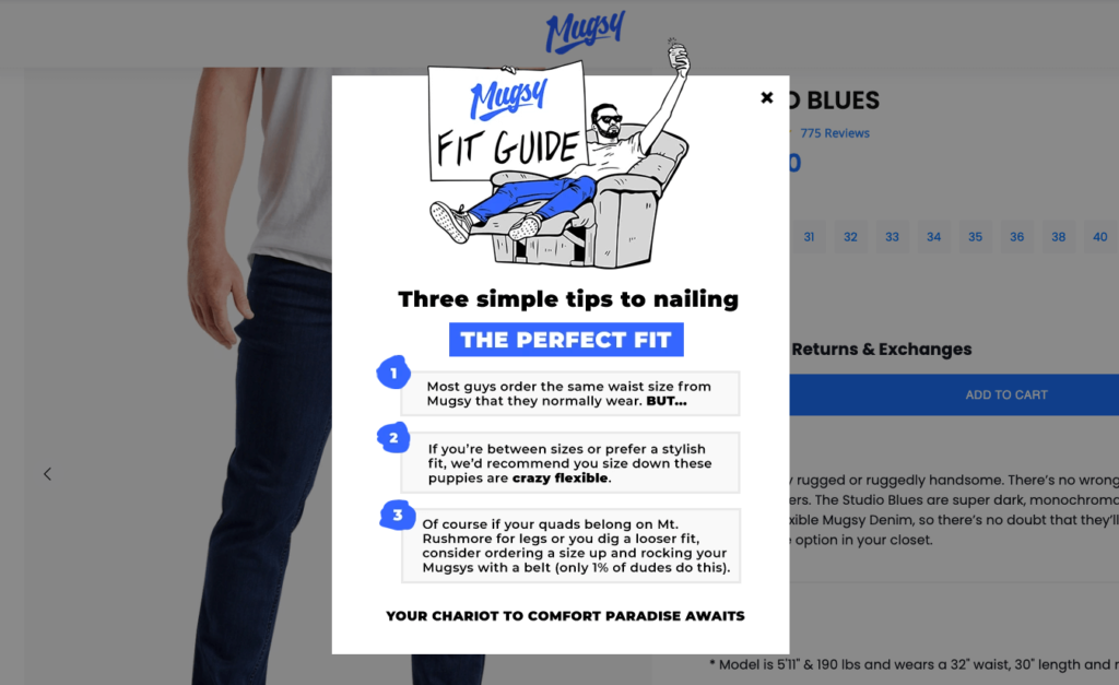
To your surprise, in this popup, you find three simple tips to buying the best-fitting jeans, rather than a conventional size chart or video guide.
Written in a humorous tone, Mugsy’s size guide explains how their fit may be different (and much comfier) than regular pants.
Mugsy’s value proposition is all about prioritizing comfort. That’s why the focus on “nailing the perfect fit” makes a lot of sense for the brand. On the other hand, it could still include a traditional size chart for the sake of clarity.
E-commerce size guide popups that open on click are pretty much the industry standard but they’re not the only option.
Many e-tailers recently started leveraging interactive fit finder quizzes that recommend the right product to shoppers based on their measurements.
Pull&Bear is one of those brands that follow this approach.
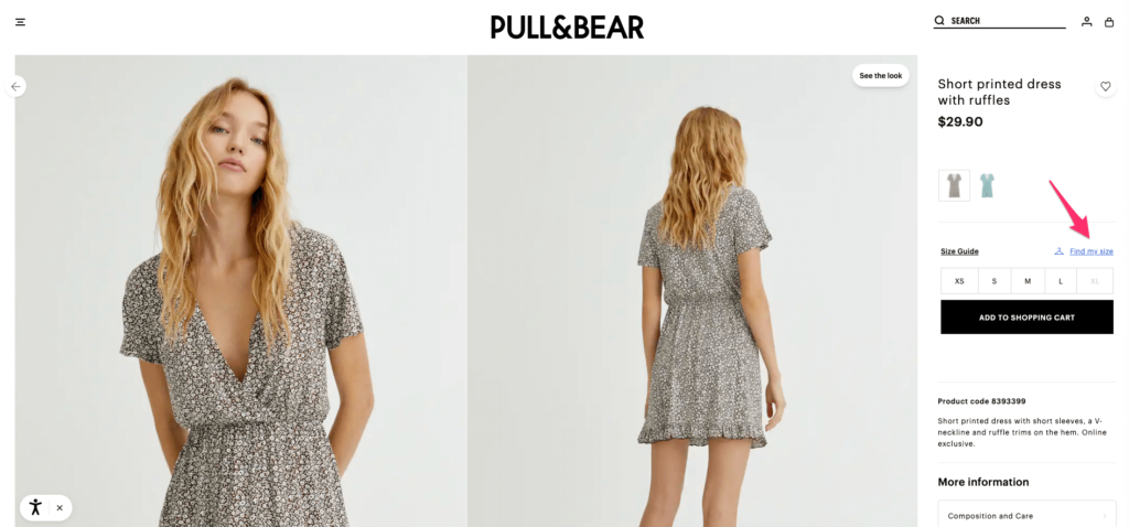
When you visit one of its product pages, you see two options: (1) “Size Guide” and (2) “Find My Size”.
While the first option simply prompts a category-specific size chart…
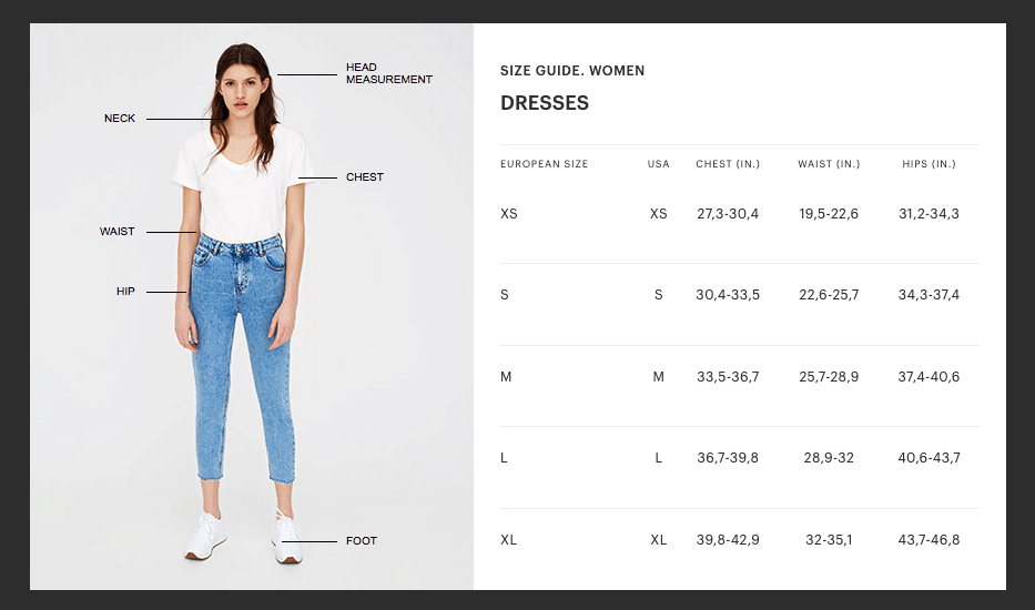
…the second link “Find My Size” starts the company’s fit finder quiz:
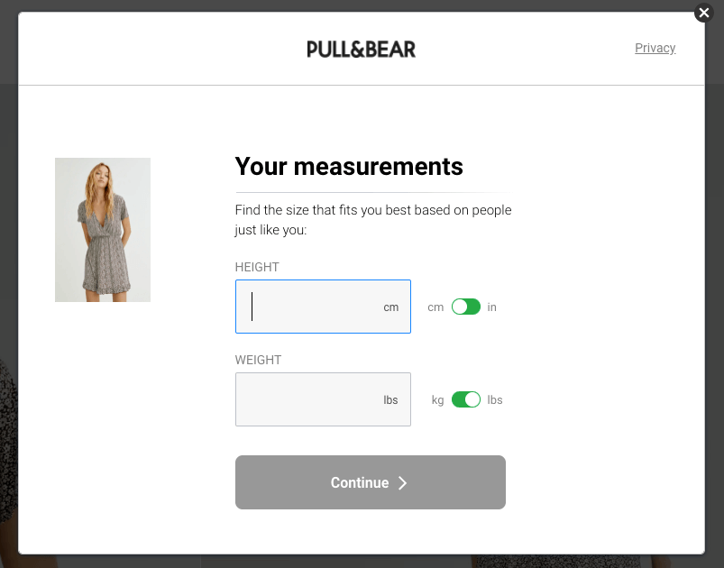
After filling out details about your height, weight, belly shape, age, and more, Pull&Bear shows the product size that’s most likely your fit.
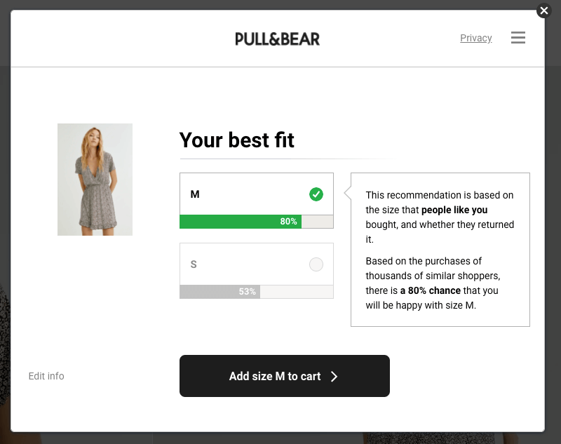
Notice the level of detail here with the use of percentages. Thousands of people (read: social proof) who are like you chose this product in this exact size. So if you’re unsure about what size to choose, you can simply trust other shoppers.
What’s more, Pull&Bear cleverly uses a call to action button in its fit finder that automatically adds the product to your cart—in your size. This is perfect for removing friction in the buying process.
Once you take the quiz and find your ideal size, Pull&Bear remembers your choice. When you visit other products on the site, the company now automatically shows you the recommended size:
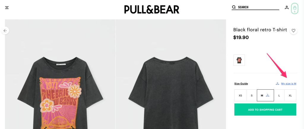
Now that you know what size to choose for each product, you can shop with one click.
If you need a powerful fit finder like Pull&Bear’s, check out Fit Analytics. If you can make do with something less advanced, you’ll like my final example.
Taylor Stitch has one of the most straightforward e-commerce size guides I’ve ever seen.
When you visit a product page on the site, you see four options below the CTA button, two of which are about size.
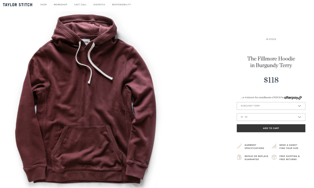
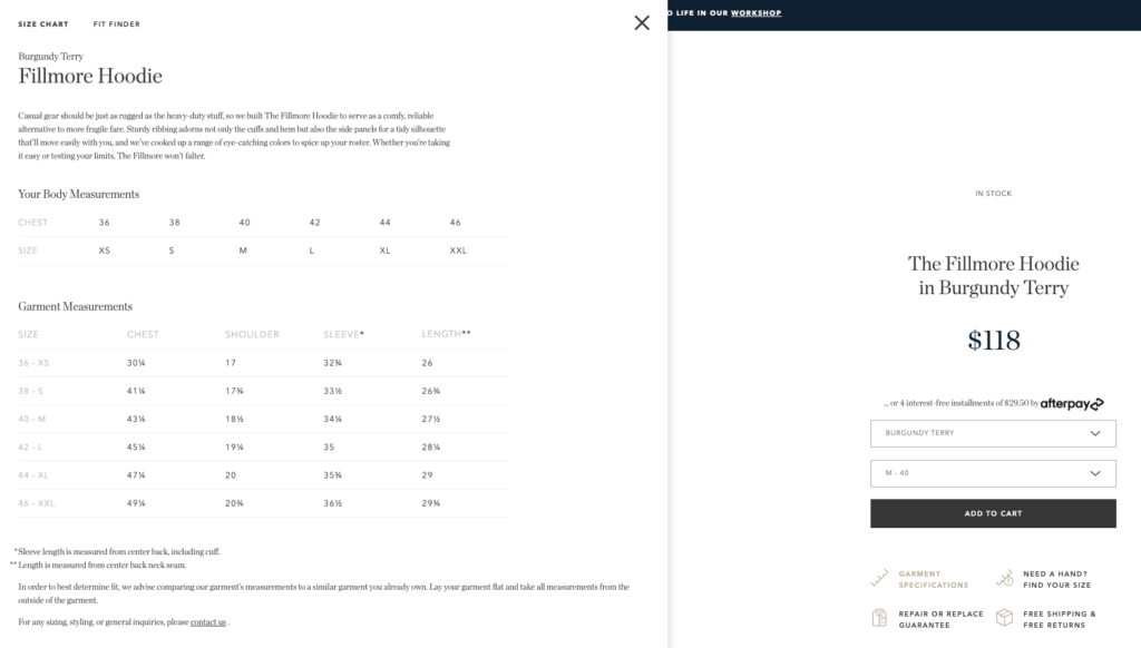
If you’re more or less confident about which size to choose, you can click “Garment Specifications” and read the product description or review Taylor Stitch’s simple size chart:
But if you’re on the fence, the company got you covered too. Clicking the “Need a Hand? Find Your Size” option opens a compact fit finder on your left sidebar.
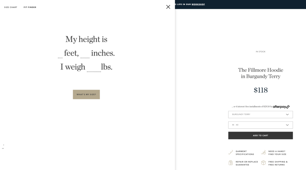
However, unlike Pull&Bear’s step-by-step fit quiz, Taylor Stitch only has two questions for you: height and weight. You can enter those two in one step and get your results right away.
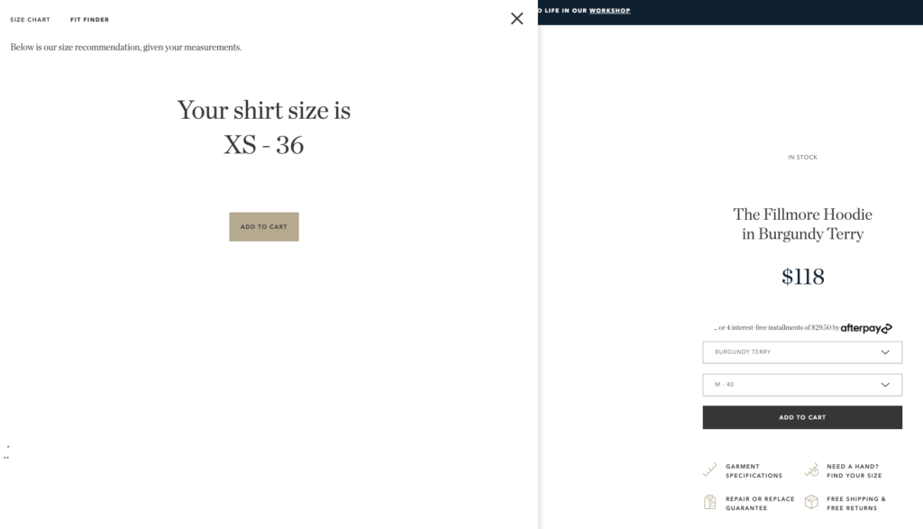
Rather than asking you to go over a chart, the company is doing the job for you. Simple and effective.
Since Taylor Stitch doesn’t ship internationally, the U.S. system of measurements works just fine for the company. But if you’re selling to a global audience, make sure to include metric conversions in your fit finder too. Otherwise, you’ll hurt, rather than improve, the shopping experience for many visitors.
As you’ve seen in this post, e-commerce size guides take many shapes and forms.
Choosing the right one for your store depends heavily on your industry and the nature of your products.
If you’re selling clothing items, a simple size guide popup might do the heavy lifting for you. But if you’re a retailer of accessories, you might want to go the extra mile, as many e-tailers in this article do.
Take inspiration from these seven size guide examples—especially if you’re suffering from high returns.
Seray is a Product Marketing Manager at Drip. When she’s not busy creating content for Drip, she can be found trying to crack the Danish language and watching Back to the Future for the hundredth time.
Start a 14-day free trial, no credit card required.